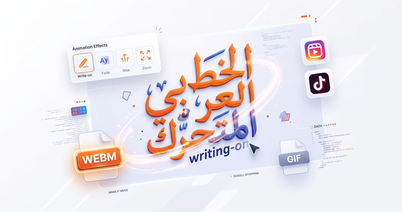
On a fast-moving feed, motion stops the scroll. Animated Arabic calligraphy — letters that write themselves on screen, fade in, or zoom into place — is one of the most eye-catching things you can post, and you can make it without any video editing software. Here's the full workflow, including the export settings that decide whether it looks good or looks broken.
Why animation works on social
Platforms like Instagram, TikTok and YouTube Shorts reward content that holds attention in the first few seconds. A line of calligraphy that draws itself stroke by stroke does exactly that: it creates anticipation, the viewer waits to read the full phrase, and that extra moment of attention is what the ranking systems are measuring.
It's also deeply fitting for Arabic specifically. Calligraphy is, by nature, about the act of writing — a discipline built around the movement of a pen across a page. Animating it doesn't impose motion on a static art form; it restores something the printed version left out.
Choosing the right effect
Different effects suit different moods, and they behave differently with different amounts of text.
Rewrite (write-on)
The text draws from right to left, following the direction Arabic is actually written. This is the only effect here that's native to the script, and it's the most satisfying for calligraphy.
Best for: Qur'anic verses, du'a, poetry, anything where the act of writing carries meaning. Watch out for: text length. A short phrase rewrites crisply in two seconds; a long verse at the same duration flies past too fast to follow. Budget roughly a second per short word.
Fade
Letters gently appear. Calm, elegant and understated.
Best for: clips that will sit under a voiceover or over other footage, and for batches of posts that need to feel like a set. It never distorts the letterforms and it tolerates any text length.
Rise
Text floats up into place while fading in. Fade with a direction — the upward drift reads as arrival.
Best for: greetings, announcements and title cards. Eid Mubarak, Ramadan Kareem, a name reveal.
Zoom
Text scales into focus. Punchy and attention-grabbing.
Best for: logo stings, opening titles, a single powerful word. Watch out for: long text. A full verse scaling up runs past the frame edges and the eye never settles. Keep Zoom to two or three words.
For sacred phrases, Rewrite or Fade feel most respectful — a zooming or bouncing Qur'anic verse tends to land badly. See our notes on using sacred text for more.
Step-by-step: animate your calligraphy
- Open the video and motion studio.
- Type your Arabic text and choose a calligraphy style. (Need ideas? Try one of these meaningful phrases.)
- Pick an effect — start with Rewrite for a classic calligraphy feel.
- Set the duration. Two to three seconds is the sweet spot for a standalone social post: long enough to read, short enough to loop before attention drifts.
- Preview the loop at least twice. Watch where the phrase comes to rest, not just where it starts.
- Export.
If you want the underlying typography set perfectly before animating, compose it in the text studio first — sizing and harakat are much easier to judge in a still.
Getting the timing right
The duration slider runs from 1 to 8 seconds. Most clips that work land in a narrow band:
- 1–2s — a logo sting or single word, fast enough to head a longer edit.
- 2–3s — the default for a standalone post.
- 4–6s — a full verse in Rewrite, or a clip sitting under narration.
- 7–8s — rarely right. If you need this long, you probably want several shorter clips cut together.
Every export holds on the settled frame after the animation completes, so the phrase stays readable at the end rather than cutting the instant it lands. That hold is what makes a loop feel deliberate instead of jumpy.
Exporting: WebM vs GIF
These two formats differ far more than the file extension suggests, and choosing wrong is the most common source of disappointment.
WebM records at 30fps at the canvas's full dimensions and preserves transparency. If your background is transparent, the exported WebM genuinely is — drop it over video in an editor and only the calligraphy shows. This is your master file, always.
GIF runs at 18fps, is downscaled to 640px wide, and is limited to a 256-colour palette. Gradients band into visible steps and motion is noticeably choppier. GIF also supports only one fully transparent colour with no partial alpha, so antialiased edges pick up a visible fringe.
The rule: export WebM every time, then produce a GIF only if a specific destination demands it. Recovering quality from a GIF is not possible.
MP4 isn't available directly yet, but every major editor — Premiere, DaVinci Resolve, CapCut, Final Cut — imports WebM. Going in via WebM also preserves the transparency an MP4 conversion would discard.
Platform-by-platform notes
Instagram Reels & Stories (1080×1920). Interface chrome covers the top and bottom of the frame. Keep the calligraphy in the middle third, and check where the animation settles — a phrase that comes to rest under the caption bar is simply lost. Instagram won't accept WebM directly, so convert to MP4 or place the WebM in an editor over a background first.
TikTok (1080×1920). Same vertical framing, but expect more UI overlay on the right side and along the bottom. TikTok's compression is aggressive on fine detail, so favour heavier hands — Reem Kufi, Lalezar — over delicate Diwani.
YouTube Shorts (1080×1920) and standard video (1920×1080). The most forgiving on quality. A transparent WebM layered over footage in your editor is the ideal workflow here.
X and LinkedIn. GIF is genuinely useful on these, since both auto-play GIFs inline. Keep the phrase short so the 640px downscale doesn't destroy it.
WhatsApp and messaging apps. GIF only. This is the one place where the format's compatibility outweighs its quality.
Tips for scroll-stopping calligraphy videos
- Keep phrases short. One powerful line beats a paragraph. This is the single highest-leverage decision.
- Add a moment of stillness. Let the finished text hold before it loops.
- Mind contrast. Dark ink on a light ground — or the reverse — reads instantly on a phone in daylight. Mid-tone on mid-tone disappears.
- Match the effect to the message. Reverent phrases deserve gentle motion; bold statements can be punchy.
- Design for unknown backgrounds. If you don't yet know what the clip will sit over, near-white or near-black ink is safer than a mid-tone, and a soft shadow gives the letters an edge against busy footage.
- Pair it with sound. A soft pen-on-paper foley or an ambient track reinforces the writing motion. The studio records a canvas, not a timeline, so there's no audio track — add it in your editor.
- Don't switch tabs while exporting. Recording runs off the live canvas in real time, and a backgrounded tab gets throttled by the browser, producing dropped or duplicated frames.
From logo to motion
If you've already made a calligraphic logo, animating it creates a memorable brand intro for your website, video outros and channel art. Export the wordmark from the logo maker, rebuild it in the video studio, and use Zoom or Rise at 1–2 seconds — short enough to sit at the head of an edit without delaying it.
A wordmark that writes itself is a small detail that makes a brand feel crafted, and almost nobody in Arabic-language markets is doing it.