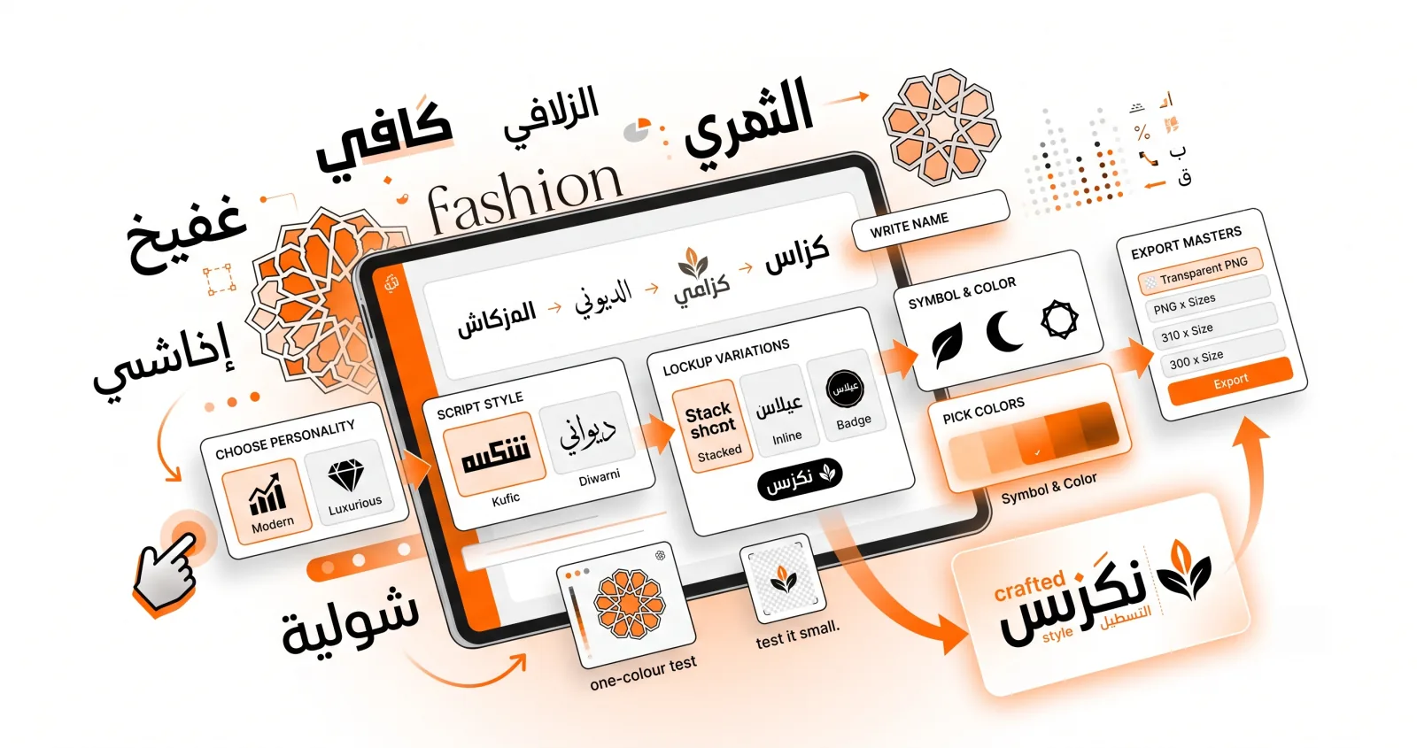
An Arabic calligraphy logo can give a brand instant elegance, authenticity, and a sense of heritage. Cafés, fashion labels, restaurants, and personal brands across the Gulf, North Africa, and beyond rely on calligraphic wordmarks to stand out. This guide walks you through designing one — even if you're not a designer — and covers the decisions that matter long after the file is exported.
Why Arabic calligraphy works so well for logos
A logo has to be distinctive, memorable, and meaningful. Arabic calligraphy delivers all three:
- Distinctiveness — flowing letterforms are hard to imitate and instantly recognisable. A Latin wordmark in a common sans blends into a thousand competitors; an Arabic wordmark does not.
- Meaning — the script carries cultural and emotional resonance that a neutral typeface can't manufacture.
- Flexibility — it scales from a tiny app icon to a storefront sign, provided you pick the right hand.
There's also a practical advantage specific to Arabic: because the script is cursive by nature, a well-set name already reads as a designed mark rather than as plain text. You get much of the effect of custom lettering without commissioning it.
Step 1: Define your brand's personality
Before choosing letters, decide on a feeling. Is your brand luxurious, modern, traditional, or playful? This determines your script:
- Kufic → modern, structured, architectural. Great for tech, fashion, and minimal brands. (See our Kufic guide.)
- Diwani → ornate and regal. Perfect for luxury, hospitality, and premium goods.
- Naskh → clean and trustworthy. Ideal for services, education, and editorial brands.
- Nastaliq → poetic and refined. Suited to art, culture, and lifestyle brands, and the right choice for Persian or Urdu-speaking markets.
Our overview of Arabic calligraphy styles can help you match a script to your mood.
Be honest about your market too. A café in Casablanca, a fintech app in Dubai and a bookshop in Lahore have genuinely different expectations, and a script that reads as elegant in one can read as foreign in another.
Step 2: Write your brand name
Open the Arabic logo maker and enter your brand name in Arabic. A few rules that hold up:
- Keep it short. One or two words. The strongest marks are brief, and Arabic's connected letterforms mean a long name becomes a dense band that's hard to parse at a glance.
- Split legal from memorable. If the registered business name is long, set the memorable part as the wordmark and put the rest in the slogan line.
- Leave the harakat off. Diacritics break up the silhouette, disappear first when the mark is scaled down, and make the lockup harder to balance. Native readers don't need them on a brand name — save them for the text studio.
- Check the spelling with a fluent reader before you go any further. Every subsequent step compounds the cost of getting this wrong.
Step 3: Choose a lockup
A lockup is how the elements are arranged together. Each solves a different placement problem:
- Stacked — name on top, symbol and slogan below. Closest to a square, which is what social avatars, app icons and stamps want. Use this as your primary mark unless you have a reason not to.
- Inline — everything on one line. Built for horizontal slots: site headers, email signatures, letterheads, invoices. This is the version you'll use most on the web.
- Badge — enclosed in a shape or frame. Reads as a seal, which suits food, craft and heritage brands. Because the enclosure defines its own edge, it survives being dropped onto busy photography where the other two get lost.
Real brands ship at least two. Build Stacked and Inline from the same name and colours — that consistency is most of what a brand system is.
Step 4: Add a symbol (optional)
A small icon — a crescent, a leaf, a coffee bean, a geometric mark — can reinforce your industry. In the logo maker you can search the full Iconify library and tint any icon to your brand colour.
Use restraint, and prefer:
- Filled over outline. Thin outline strokes vanish at small sizes and clash with a heavy Arabic wordmark.
- Matched weight. A hairline symbol beside a heavy wordmark looks like two logos glued together.
- Abstract over literal. A coffee cup for a café is the icon every competitor already has. Geometric forms drawn from Islamic pattern age far better.
And consider skipping it entirely. Many of the strongest Arabic marks are wordmark-only, because the script is already distinctive enough to carry the brand. Add a symbol when the name is very short and needs weight, or when you need a standalone icon for app tiles.
Step 5: Choose your colours
Colour sets the tone:
- A single ink colour keeps things elegant and reproducible.
- Gold or deep jewel tones read as premium.
- High-contrast monochrome stays versatile across print and screen.
The studio lets you colour name, slogan and symbol independently — which is a trap. Use one accent at most. Tint the symbol in the accent and set the name in near-black, or invert that, but don't give all three different hues.
Then run the one-colour test: set everything to flat black and look at it. Embroidery, engraving, stamping, faxed forms and single-colour print will all force this on you eventually. If the mark falls apart without colour, the colour was doing work the shapes should be doing.
Step 6: Export at the right size
Export a transparent PNG at the largest size — 2048px — and scale down from there. You can always shrink a raster logo; you can never enlarge one.
A usable brand kit is four files, not one:
- Stacked, transparent PNG, 2048px — the master.
- Inline, transparent PNG, 1024px — website header and email signature.
- Stacked, 512px, on your brand colour — social avatars need an opaque square.
- A one-colour version — for print, stamping and embroidery.
Keep the settings written down so you can re-export variations later without guessing.
Logo design best practices
- Test it small. Export at 512px and look at the file thumbnail in your file manager. If you can't tell what it says, the hand is too delicate.
- Keep it legible. Ornate is good; unreadable is not.
- Leave breathing room. Define a clear space around the mark — roughly the height of one letter — and never let anything intrude on it.
- Check it on both grounds. Your logo will appear on white and on dark. Make sure it works on both, or produce a variant.
- Don't stretch it. Scale proportionally, always. Non-uniform stretching destroys the stroke weight relationships that make the script work.
Bilingual logos: the hard part
If your brand operates in both Arabic and Latin markets, you'll eventually need a bilingual mark. This is genuinely difficult, and worth knowing before you start:
- The scripts have different vertical proportions. Arabic's visual centre sits lower, and its ascenders and descenders behave differently from Latin's x-height system. Setting both at the same point size produces a mismatch — the Arabic will usually look small.
- Match by optical weight, not by numbers. Adjust until the two halves look balanced, then ignore what the size fields say.
- Pick a compatible Latin face. Pair Kufic with a geometric sans; pair Naskh with a humanist serif. Cairo is the most Latin-compatible Arabic font in the studio.
- Decide on a hierarchy. One script leads and the other supports. Trying to give both equal prominence usually produces a mark that reads as two logos.
The practical approach: export the Arabic wordmark as a transparent PNG from the logo maker, then compose the bilingual lockup in your own design tool where you can nudge each half independently.
A note on trademarks
Worth being clear about, because it catches people out. The calligraphy fonts here are open-source typefaces, and the symbols come from open icon sets. You are free to use them commercially, including in a logo — but setting words in an existing typeface does not create an original artwork you can exclusively own. Anyone with the same font can reproduce your wordmark exactly.
If the mark genuinely matters to your business:
- Use the studio to settle the concept, the script, the lockup and the colours.
- Have a designer redraw the letterforms as custom outlines, adjusting the joins and proportions. That artwork is original and protectable.
- Register the trademark in the markets where you trade.
For a side project, a small shop or a personal brand, the exported PNG is entirely sufficient. For anything you intend to scale, treat it as an excellent, free starting point rather than the final asset.
Bring it to life
Once your wordmark is ready, you can create an animated version for your website intro or social channels — calligraphy that writes itself on screen is a memorable brand moment, and the video studio exports it with a transparent background so it drops straight over your footage.