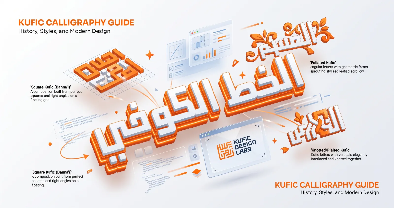
Of all the Arabic scripts, none is more recognisable to modern eyes than Kufic (الخط الكوفي). Its bold, angular geometry has decorated mosques, coins, and manuscripts for over a thousand years — and today it powers some of the most striking logos and graphic designs in the world.
Origins in the city of Kufa
Kufic takes its name from Kufa, a garrison city in Iraq founded around 638 CE. It didn't appear from nothing: it evolved from earlier Nabataean and Hijazi scripts, the angular hands already in use across the Arabian peninsula. Within a century it had become the formal script for writing the Qur'an.
Early Kufic Qur'ans are unmistakable objects. They were written on parchment in wide horizontal formats — landscape rather than portrait, which is unusual for manuscripts — because Kufic's long horizontal extensions needed the width. Lines were few, letters were large, and a single page might carry only three or four lines of text. These manuscripts are among the most treasured objects in Islamic art.
What sets Kufic apart is its character: straight lines, sharp angles, and strong horizontals, with letters sitting on a firm baseline and verticals kept deliberately short. Where later cursive scripts flow, Kufic feels built — almost architectural.
The dots came later
Early Kufic was often written without diacritical dots — the marks that distinguish ب from ت from ث. Readers were expected to know the text well enough to disambiguate from context. Dots and vowel marks were added to the system gradually, initially as coloured dots rather than the shapes we use today. This is worth knowing because it explains why very early Kufic looks so stripped-down and abstract to modern eyes: a good deal of the information we now expect simply isn't there.
The main variants of Kufic
Over the centuries, Kufic branched into several distinctive forms.
Square (Geometric) Kufic
Also called banna'i — "builder's" Kufic — this variant reduces letters to a strict grid of squares and right angles. Every stroke is either horizontal or vertical; curves are eliminated entirely. It developed as an architectural technique, formed from glazed and unglazed bricks laid into walls and domes, particularly across Persia and Central Asia. The most spectacular examples cover entire building facades, where the pattern reads as ornament from a distance and resolves into text up close.
Square Kufic is endlessly popular today because its logic is identical to pixel and grid design. If you have ever laid out a logo on a modular grid, you already understand how it works.
Foliated Kufic
Here the ends of letters sprout leaf-like shapes, softening the geometry with vegetal ornament. It became common in architectural inscriptions from the 10th century onward, particularly under the Fatimids in Egypt.
Floriated Kufic
A step further than foliated, floriated Kufic adds flowers and intricate scrollwork, weaving the text into dense decorative panels where letter and ornament become hard to separate.
Knotted and Plaited Kufic
In these elaborate forms, the vertical strokes intertwine and knot together at the top, creating ornamental bands prized in architecture. The knots are often purely decorative, filling the space above the line where Kufic's short verticals would otherwise leave a gap.
Why modern designers love Kufic
Kufic has had a major revival in contemporary design, and for good reason:
- It's geometric. That makes it a natural fit for grids, logos, and digital screens — the same qualities that let it be built from bricks let it be built from pixels.
- It's bold. Near-uniform stroke weight means it holds together at small sizes and at distance, where scripts with fine hairlines fall apart.
- It's timeless. It signals heritage and authenticity while still feeling contemporary — a rare combination.
- It reproduces anywhere. Kufic survives embroidery, engraving, single-colour print, embossing and laser cutting. Ornate scripts do not.
You'll find Kufic-inspired lettering in fashion branding, sports kits, museum identities, national logos across the Gulf, and countless app icons.
How to use Kufic in your own designs
You don't need to master a reed pen to work with Kufic. Here's a workflow that produces good results:
- Open the Arabic calligraphy generator and choose the Reem Kufi style.
- Type a short, punchy word or phrase. Kufic shines with brevity — two or three words is the sweet spot, and anything past five reads as texture rather than language.
- Set the size large. Kufic's proportions are designed to be seen, and it looks weak at body-text scale.
- Leave the harakat off. Diacritics fight with Kufic's clean horizontals and clutter the silhouette that gives the script its power.
- Stick to one or two colours to preserve the geometric impact.
- Export a transparent PNG so you can layer it into your design.
For a brand mark specifically, the logo maker lets you build a balanced Kufic lockup with an optional symbol — see our step-by-step logo guide.
Working in square Kufic
Digital fonts don't produce true square Kufic — it isn't a typeface so much as a construction method, since each composition is custom-fitted to its own grid. If you want to build one properly:
- Start with graph paper or a pixel grid, typically 15×15 or larger.
- Write out your phrase in ordinary Kufic first, so you know the correct letter forms and connections.
- Redraw each letter using only horizontal and vertical strokes of uniform width, maintaining a consistent gap — usually one unit — between all strokes.
- Adjust the composition until the black and white areas balance. The classical rule of thumb is roughly equal distribution of ink and ground.
- Verify with a fluent reader. Square Kufic is genuinely hard to read, and it is very easy to produce something that no longer says what you intended.
Design tips for great Kufic
- Embrace the grid. Kufic looks best when it feels constructed, not loose. If your composition looks casual, something has gone wrong.
- Less is more. Resist over-decorating; the geometry is the statement.
- Pair with whitespace. Give those bold forms room to breathe. Crowding Kufic kills it faster than any other error.
- Test at small sizes. Export at 512px and look at the thumbnail. If it works as a favicon, it will work anywhere.
- Be careful with letter spacing. A little added spacing enhances Kufic's architectural feel — this is the one script where opening it up is legitimate. But too much and the word fragments into unrelated shapes.
- Don't stretch it non-uniformly. Scaling Kufic horizontally to fill a space destroys the stroke-weight consistency the whole style rests on. Resize proportionally, always.
Common mistakes
Using Kufic for a long sentence. The single most frequent error. Kufic has no mechanism for guiding the eye through a lot of text; every word looks structurally similar, and readers get lost. Set long text in Naskh.
Adding a gradient to thin strokes. Kufic's power comes from flat, confident shapes. Gradients muddy them.
Mixing Kufic with an ornate Latin script. If your design is bilingual, pair Kufic with a geometric Latin sans — something with similarly uniform stroke weight. A calligraphic Latin face beside Kufic looks like an accident.
Assuming any angular Arabic font is Kufic. Many display faces are angular without following Kufic's proportional logic. Reem Kufi, the Kufic hand in our font guide, was drawn specifically on Kufic principles.
Kufic proves that the oldest script can also be the most contemporary. Want to see your words rendered in it? Try the Kufic style in the studio →