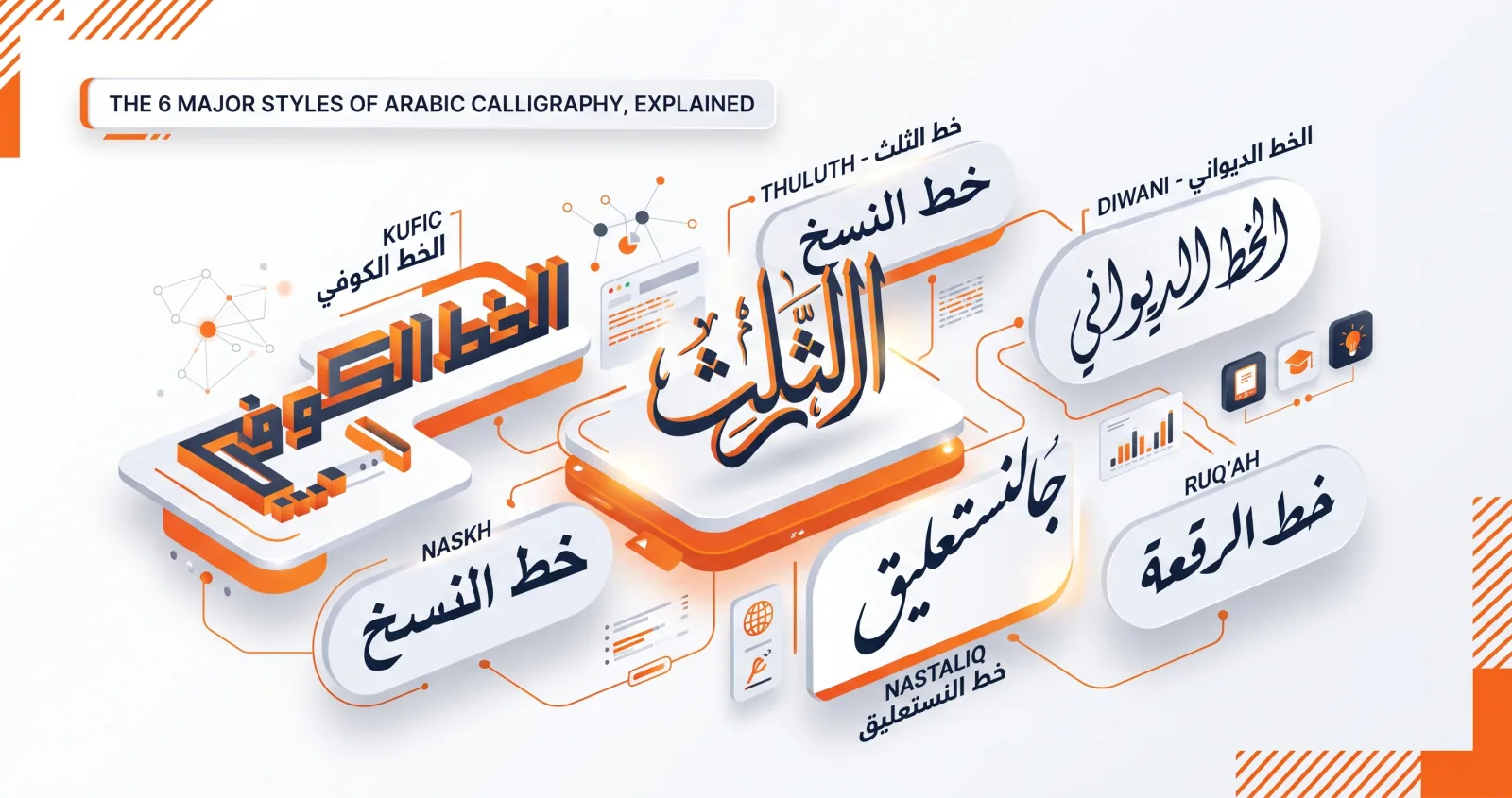
People often talk about "Arabic calligraphy" as if it were one thing, but it is really a family of distinct scripts, each developed for a different purpose over more than a thousand years. Knowing them helps you choose the right voice for your design — and helps you recognise what you're looking at. Here are the six classical styles, plus the regional hands that fall outside the canon.
Where "the six pens" come from
The traditional grouping is called al-aqlām al-sitta, "the six pens," consolidated by the calligrapher Yaqut al-Musta'simi in 13th-century Baghdad. The six are Naskh, Thuluth, Muhaqqaq, Rayhan, Tawqi and Riqa — a list that surprises people, because it doesn't include Kufic, Diwani or Nastaliq.
The reason is chronology. Kufic predates the system; Diwani and Nastaliq came later, from the Ottoman and Persian courts respectively. What follows is the practical modern list — the six styles a designer actually encounters — rather than the strict historical canon.
1. Kufic (الخط الكوفي)
The oldest Arabic script, Kufic emerged in the 7th century and takes its name from the city of Kufa in Iraq. It is angular, geometric, and architectural, with strong horizontal strokes and short verticals sitting on a firm baseline. Early Qur'ans were written in Kufic on wide, horizontal parchment sheets — a format chosen partly to accommodate its long horizontal extensions.
How to recognise it: straight lines and right angles dominate; there is almost no curve. Verticals are short and stubby relative to the long horizontals. Letters do not flow into each other so much as sit beside each other. Early Kufic often has no dots at all.
Variants worth knowing: square (banna'i) Kufic reduces everything to a grid of squares, and is what most modern "Kufic logo" work draws on. Foliated and floriated Kufic sprout leaves and flowers from the stroke ends.
Best for: logos, monograms, tile-like patterns, and anything that needs a bold, timeless, structural feel. Avoid for: long passages — Kufic becomes a wall of texture past a few words. Learn more in our complete guide to Kufic calligraphy.
2. Naskh (خط النسخ)
Developed into a refined form by Ibn Muqla in the 10th century and perfected by Ibn al-Bawwab, Naskh is rounded, clear, and highly legible. Its name comes from nasakha, "to copy," because it was the workhorse script for copying books and the Qur'an. Almost every Arabic text font you read today descends from it.
How to recognise it: modest, even proportions; short ascenders; deep rounded bowls; a consistent horizontal baseline. Nothing about it demands attention, which is precisely the point.
Best for: body text, long passages, readable quotes, religious text, and any design where clarity matters most. It is the only family here that survives at three or more lines without becoming exhausting. Avoid for: logos that need to stand out — Naskh's neutrality works against you when you want distinctiveness.
3. Thuluth (خط الثلث)
Thuluth means "one-third," probably referring to the proportion of the pen width to the alif height, or the ratio of curved to straight strokes. It is a large, majestic, ornamental script with tall sweeping verticals and curves that interlace and overlap. You'll see it on mosque domes, on the kiswah covering the Kaaba, and in the grand titles of manuscripts.
How to recognise it: dramatic height contrast — very tall verticals against deep, wide bowls. Letters overlap and stack in layers. Diacritics are often stylised and placed for composition rather than sitting in their default positions.
Thuluth is widely considered the most difficult script to master, and is traditionally the test a student must pass before receiving an ijazah.
Best for: headings, ceremonial pieces, and ornate compositions where grandeur is the goal. Note: no digital font truly captures Thuluth, because its beauty comes from the calligrapher's real-time decisions about overlap and stacking — decisions a static typeface can't make. Aref Ruqaa in the studio gets closest in spirit.
4. Diwani (الخط الديواني)
Diwani was developed in the Ottoman court and used for official diwan (chancery) documents. It is intensely decorative and cursive, with letters that climb, overlap, and curl into one another. Its density was a security feature: the tightly interlocked forms made royal decrees very hard to forge or alter.
How to recognise it: the baseline rises. Words tend to climb toward the end of the line rather than sitting flat. Letters curve generously and nest into each other, and there is often ornamental filling between them.
A more elaborate variant, Diwani Jali, packs the space between letters with dots and decorative marks until the text becomes a dense, near-solid panel.
Best for: invitations, certificates, luxury branding, and flowing designs with a regal mood. Avoid for: anything that must be read quickly or reproduced small.
5. Nastaliq (خط النستعليق)
Created by the Persian master Mir Ali Tabrizi in the 14th century — the name is a contraction of naskh and taʿliq, the two scripts it merges — Nastaliq is the graceful "hanging" script. Words cascade diagonally from upper right to lower left, as though suspended. It is the dominant script for Persian, Urdu, and much South Asian poetry, and it remains the standard for Urdu newspapers today.
How to recognise it: there is no flat baseline. Each word steps downward. Strokes have strong thick-to-thin contrast, and the whole line has a swinging, rhythmic quality.
Practical warning for designers: Nastaliq needs roughly double the vertical space of any other hand. If you set it at a normal line height, the descending tail of one line will collide with the line beneath. Push line height to 1.8 or higher.
Best for: poetry, lyrical quotes, and designs with a soft, romantic elegance. It is also the correct choice if your audience is Persian, Urdu or Pashto-speaking, where Naskh can read as foreign.
6. Ruqʿah (خط الرقعة)
Ruqʿah is the simple, practical everyday hand, standardised in the Ottoman era by Mumtaz Bey. With short strokes, small rounded forms and minimal flourish, it is the script most Arabic speakers actually use for handwriting, and it is the first hand taught in schools across the Arab world.
How to recognise it: compact and quick-looking. Letters sit close together, teeth on letters like sīn are often flattened into a straight line, and there is very little height variation.
Best for: clean, modern, no-fuss text and a casual, contemporary feel. In digital design, modern sans faces like Cairo and Tajawal fill much the same role.
Beyond the six: regional hands
Three traditions are widely used but rarely make the canonical lists:
- Maghribi (المغربي) — the hand of Morocco, Algeria, Tunisia and historically al-Andalus. Written with a pointed nib rather than a chisel-cut one, giving even stroke width, and characterised by deep, sweeping semicircular bowls that drop far below the baseline. Its fāʾ and qāf are dotted differently from the eastern convention, which trips up readers from either region.
- Sini (صيني) — Chinese Arabic calligraphy, written with a brush rather than a reed. Strokes taper and swell in a way no reed pen produces.
- Bihari — a medieval Indian script with dramatically thickened horizontal strokes, used in Qur'ans produced in the subcontinent.
Choosing the right style
| If you want… | Reach for… |
|---|---|
| A bold logo or monogram | Kufic |
| Maximum readability | Naskh |
| Grand, ornamental titles | Thuluth |
| Luxurious invitations | Diwani |
| Poetic, flowing elegance | Nastaliq |
| Clean, modern simplicity | Ruqʿah or a modern font |
| A Persian or Urdu audience | Nastaliq |
| A North African audience | Maghribi, or a neutral Naskh |
How to tell them apart in three seconds
If you only remember one heuristic, use this one — look at the baseline:
- Flat and rigid, with sharp angles → Kufic
- Flat and calm, with rounded letters → Naskh or Ruqʿah
- Flat but with dramatic tall verticals and overlap → Thuluth
- Rising toward the end of the line → Diwani
- Stepping downward, word by word → Nastaliq
See them side by side
The fastest way to internalise these differences is to type one word and flip through every style. In the Arabic calligraphy generator you can switch instantly and watch the same text transform — the studio's thirteen hands cover Kufic, Naskh, Diwani, Nastaliq and modern families.
Try writing your name — here's how to do it in minutes — or pick a meaningful phrase and feel the difference each script brings. If you want the historical background behind the whole tradition, start with what Arabic calligraphy is.