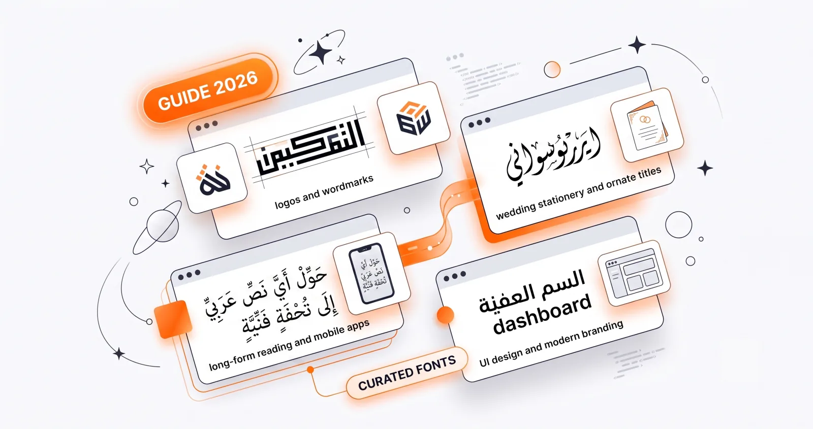
Choosing the right Arabic font can make or break a design. The good news: there's a rich ecosystem of high-quality, open-source Arabic typefaces, each suited to a different job. Here are thirteen of the best, organised by calligraphic family, with honest guidance on what each is good at — and where each falls down. Every font below is available in the Arabify studio, so you can test them on your own text without installing anything.
What actually makes an Arabic font good
Before the list, it's worth knowing what to evaluate. Arabic typography has failure modes that don't exist in Latin type:
- Connection quality. Letters must join cleanly at the baseline. Cheap fonts produce visible seams or misaligned joins between letter pairs.
- Diacritic positioning. Harakat need to sit correctly above and below each letter, and to shift when they'd collide with an ascender. Many free fonts position them naively and produce overlaps on common words.
- Ligature support. Certain letter combinations — most importantly lām-alif (لا) — must form a single ligature. A font that renders لا as two separate letters is broken.
- Weight range. A single-weight font limits you to one hierarchy level.
- Latin companion. If your design is bilingual, the font's Latin glyphs need to share proportions with the Arabic, or you'll be mixing two unrelated designs.
All thirteen fonts below handle connections and lām-alif correctly. Where they differ is diacritics, weight range, and intended use.
Naskh fonts: clear and classic
Naskh is the readable, rounded script behind most printed Arabic. Use it whenever legibility matters.
Amiri
A revival of the Bulaq Press Naskh type used in early 20th-century Cairo, designed by Khaled Hosny. Elegant, book-like, and the most historically grounded face in the list.
Strengths: superb diacritic handling, generous counters, extensive glyph coverage including Qur'anic marks. Holds up from small sizes to poster scale. Weaknesses: its traditional character can read as old-fashioned for a tech or youth brand. Use for: Qur'anic text, poetry, quotes, editorial work. Our top all-round pick — if you're unsure, start here.
Scheherazade
A traditional Naskh from SIL International, slightly heavier than Amiri with a wider aperture.
Strengths: the best harakat rendering of any font here. Marks sit high and clear, so densely vocalised passages stay readable where other fonts turn muddy. Weaknesses: limited weight range; less refined than Amiri at display sizes. Use for: heavily vocalised religious text, language-learning materials, anything where every mark must be unambiguous.
Lateef
A lighter, more compact Naskh, also from SIL.
Strengths: space-efficient. Useful when you have several lines to fit and Amiri starts to feel bulky. Weaknesses: thins out badly at small sizes, and its lightness fights against coloured or textured backgrounds. Use for: multi-line layouts with tight vertical space.
Markazi
A contemporary Naskh with a subtle editorial contrast, designed for both screen and print.
Strengths: modern feel without abandoning Naskh structure; variable weight. Weaknesses: less traditional authority than Amiri for sacred text. Use for: subheadings, pull quotes, magazine-style layouts.
Use Naskh for: body text, long quotes, religious texts, and readable designs.
Kufic fonts: bold and geometric
Kufic is angular and architectural — the natural choice for logos and statements.
Reem Kufi
A clean modern Kufic by Khaled Hosny, drawn on genuine Kufic proportional logic rather than simply being angular.
Strengths: near-uniform stroke weight means it survives being reproduced tiny, embroidered, engraved or printed in one colour. The best logo font in this list. Weaknesses: poor with harakat — the marks clutter its clean horizontals. Unsuitable for more than a few words. Use for: logos, headings, patterns, app icons.
Use Kufic for: wordmarks, titles, icons, and bold short phrases. Learn more in our Kufic guide.
Diwani fonts: ornate and flowing
Diwani is the decorative Ottoman chancery script, full of curves and movement.
Aref Ruqaa
A graceful traditional hand with strong stroke contrast and a lively baseline.
Strengths: the most genuinely calligraphic face here. Beautiful for elegant titles and the closest any font in the studio gets to a Thuluth feel. Weaknesses: the thin strokes disappear at small sizes. Test before committing it to a logo. Use for: invitations, certificates, luxury titles, wedding stationery.
Rakkas
A heavy display Diwani with strong personality.
Strengths: enormous presence; excellent for posters and headlines where you want the type to carry the whole design. Weaknesses: almost no clearance above the letters, so harakat collide badly. Set it clean. Use for: posters, headlines, packaging. Never for: vocalised text.
Use Diwani for: invitations, certificates, luxury branding, and ornamental headings.
Nastaliq fonts: poetic and elegant
Nastaliq is the soft, "hanging" script of Persian and Urdu literature.
Gulzar
A contemporary Nastaliq that captures the script's cascading elegance.
Strengths: genuinely correct Nastaliq behaviour — words step down diagonally as they should, which is technically difficult to implement. Weaknesses: needs roughly double the line height of any other font. At default spacing, lines will overlap. Set line height to 1.8 or more. Use for: poetry, lyrical quotes, and any design aimed at Persian, Urdu or Pashto readers.
Use Nastaliq for: poetry, romantic designs, and anything with a refined, literary mood.
Modern fonts: clean and contemporary
For UI, branding, and a minimal look, modern sans and display typefaces shine.
Cairo
A versatile modern sans with a large weight range.
Strengths: the most Latin-compatible font here — its Arabic and Latin share proportions, making it the safest choice for bilingual work. Excellent on screen. Weaknesses: neutral to the point of being generic; it won't give a brand character on its own. Use for: interfaces, websites, bilingual layouts, clean branding.
Tajawal
A friendly geometric sans, warmer and rounder than Cairo.
Strengths: approachable without being childish. Good weight range. Weaknesses: less formal authority than Cairo for corporate or institutional work. Use for: consumer apps, friendly brands, app screenshots.
El Messiri
A display face that keeps a trace of calligraphic contrast while staying modern.
Strengths: the best middle ground when Naskh feels too traditional and Cairo too plain. Distinctive without being loud. Weaknesses: not a body-text font; it tires the eye over long passages. Use for: hospitality and lifestyle branding, headings, editorial titles.
Lalezar
A rounded, poster-weight display font with real personality.
Strengths: maximum impact in minimum space. Reads instantly at any distance. Weaknesses: single weight, no subtlety, and hopeless with diacritics. Use for: headlines, price tags, food and entertainment brands, event posters.
Marhey
A playful, energetic display style with an informal bounce.
Strengths: genuinely fun, which is rare in Arabic display type. Weaknesses: its informality rules it out for anything serious, and definitively for religious text. Use for: youth brands, stickers, casual social posts, children's content.
Use modern fonts for: apps, websites, packaging, and minimalist branding.
Licensing: what "free" actually means
Every font listed here is open-source, released under either the SIL Open Font License (OFL) or a similar permissive licence. In practice this means:
- You can use them commercially, including in a logo, with no fee and no attribution requirement.
- You can embed them in websites, apps and documents.
- You cannot sell the font files themselves.
- Under the OFL, if you modify a font and redistribute it, the derivative must also be OFL and must not use the original's reserved name.
One important nuance for brand work: setting your company name in an open-source font does not give you exclusive rights to that rendering. Anyone can produce the identical wordmark. If the mark matters commercially, have a designer redraw the letterforms into custom outlines — at which point the artwork is original and can be protected.
How to choose the right font
Ask four questions:
- What's the purpose? Long text needs legibility (Naskh, modern sans); a logo wants impact (Kufic, Diwani).
- What's the mood? Luxurious (Diwani), poetic (Nastaliq), scholarly (Amiri), or contemporary (Cairo, Tajawal)?
- Will it use harakat? If so, pick a font with strong diacritic support — Amiri or Scheherazade. Avoid Rakkas, Lalezar and Reem Kufi entirely. See our guide to harakat.
- How small will it get? If the answer includes "favicon," you need Reem Kufi or Cairo, not Aref Ruqaa.
Pairing fonts
Two-font systems work well in Arabic, but only with real contrast between roles:
- Reem Kufi + Cairo — geometric headline, neutral body. The most reliable pairing for brands.
- Aref Ruqaa + Amiri — ornate title, classical body. Good for invitations and certificates.
- El Messiri + Tajawal — characterful heading, friendly body. Suits hospitality and retail.
Avoid pairing two faces from the same family; the difference reads as a mistake rather than a decision.
Try them all in one place
The fastest way to find your font is to type your text once and flip through every style. In the calligraphy generator you can compare all thirteen with your own words — no downloads, no installs, no waiting on a preview to render.